
Post 1 (Interactive Plots)
Let’s make some interactive visualizations for the NOAA-GHCN (global temperature) dataset!
Here is the post’s general layout:
- Preparation
- Create Database Tables
- Before We Plot
- First Plot
- Second Plot
- Third Plot
Let’s dive into it!
1. Preparation
First, we import necessary packages for this project.
# packages for data manipulation
import pandas as pd
import sqlite3
import numpy as np
# packages for ploting and data analysis
from plotly import express as px
from plotly.io import write_html
from sklearn.linear_model import LinearRegression
2. Create Database Tables
Now we can create database tables with the sqlite3 package!
Before Creating Tables
We first connect to a temporary database.
conn = sqlite3.connect("temp.db")
Note: if temp.db did not exist before connection, it will be created.
This will be the database where we store the 3 tables we’re going to create!
a. temperatures Table
We first create a table for the temperatures data.
Before we jump in, we want to take a look at the dataset, and decide whether it needs cleaning.\ Since the dataset is huge, we will use this trick of chunksize, in which you read the data a chunk at a time.
# reading csv by chunksize of 100,000 rows at a time
df_iter = pd.read_csv("temps.csv", chunksize = 100000)
df_iter works as a iterator, thus it also has the __next__() function. We can use this to look at the dataframe chunk we read.
# looking at the dataframe chunk we read
df_iter.__next__()
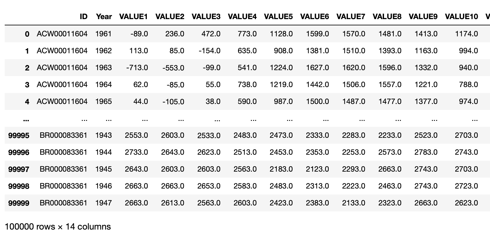
We see that the each month’s data is in a separate column. But it is hard to plot with data like that. Thus, we can use a trick to first make it multi-index, then use the stack function to stack these columns into a single column, and finally reset the index.
Since we’ll be doing the cleaning for every chunk of data, we will enclose the cleaning steps in a function.
# write a funciton to clean the raw temperature data
def cleaning_temp(df):
"""
This function takes in a piece of dataframe,
and returns a cleaned version of the dataframe.
It rearranges columns from horizontal (by month) to vertical with an extra month column,
put temperature in celcius,
and rename the columns to make them more make sense
"""
# reorder columns
df = df.set_index(keys=["ID", "Year"]).stack().reset_index()
# rename columns
df = df.rename(columns = {"level_2" : "Month" , 0 : "Temperature"})
# get months
df["Month"] = df["Month"].str[5:].astype(int)
# put temperature in celsius
df["Temperature"] = df["Temperature"] / 100
return (df)
Let’s take a look at how the cleaned data would look like:
cleaning_temp(df_iter.__next__())
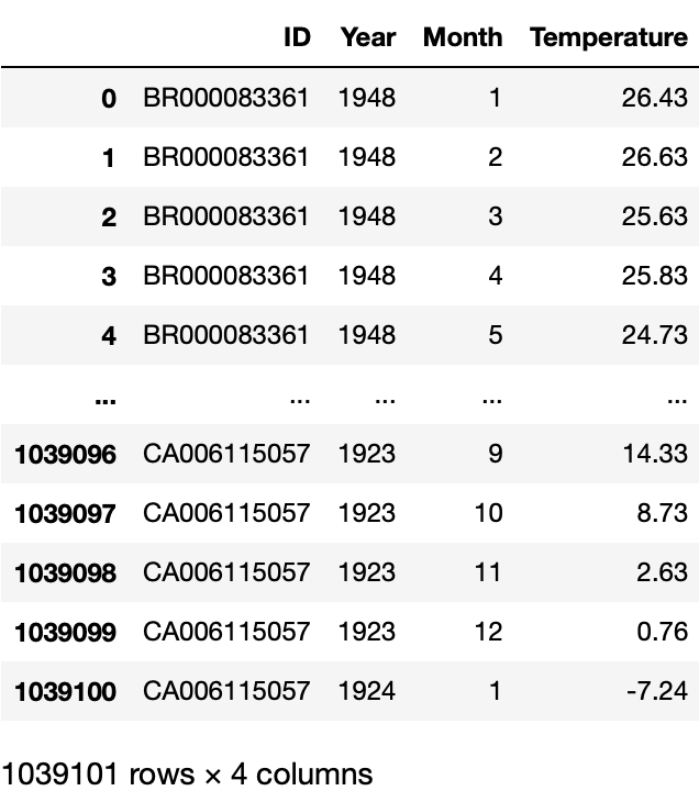
It looks like what we want! We can now create the table, with the chunksize trick, the cleaning function we just created, and the to_sql function in Pandas:
# read raw data by chunks
df_iter = pd.read_csv("temps.csv", chunksize = 100000)
for df in df_iter:
# clean each chunk
df = cleaning_temp(df)
# append each chunk to the table
df.to_sql("temperatures", conn, if_exists = "append", index = False)
b. stations Table
Since the stations dataset is small, we can just read it directly.
# read raw data
url = "https://raw.githubusercontent.com/PhilChodrow/PIC16B/master/datasets/noaa-ghcn/station-metadata.csv"
stations = pd.read_csv(url)
Likewise, let’s take a look at the raw data and see if we need to clean anything.
stations
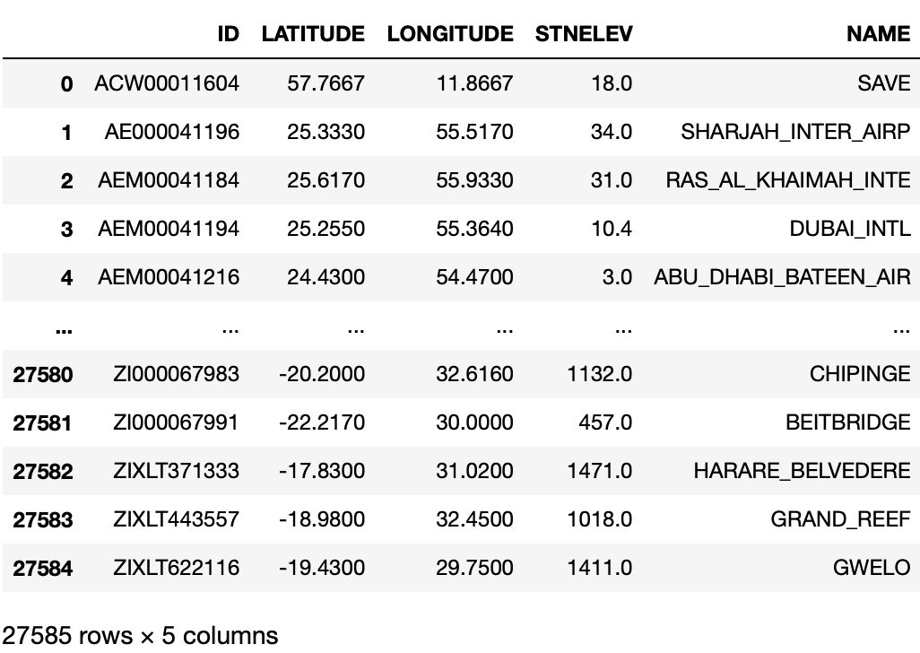
Everything looks good to us, therefore we can create the table now, with the to_sql function we used earlier.
# create table
stations.to_sql("stations", conn, if_exists = "replace", index = False)
c. countries Table
Similarly, since the countries dataset is small, we can just read it directly.
# read raw data
url = "https://raw.githubusercontent.com/mysociety/gaze/master/data/fips-10-4-to-iso-country-codes.csv"
countries = pd.read_csv(url)
And again let’s take a look at the raw data and see if we need to clean anything.
countries
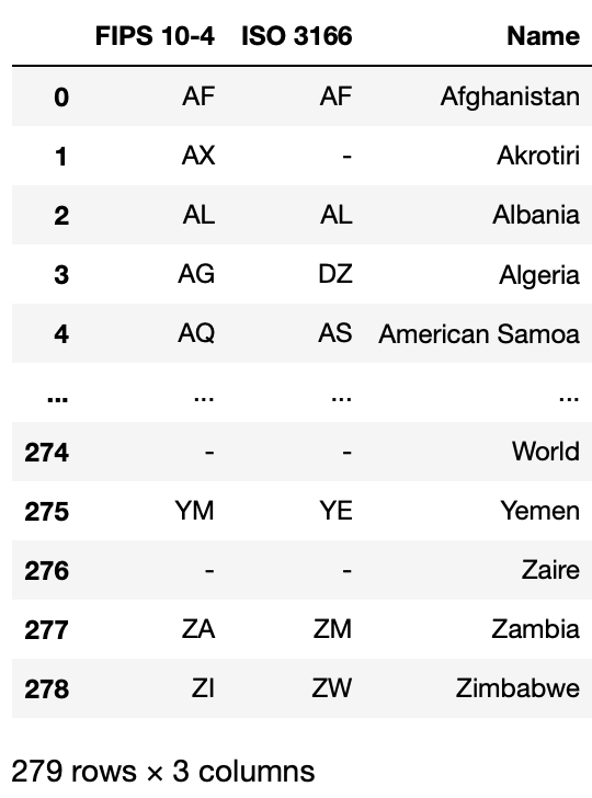
We don’t need the “ISO 3166” column, and for the sake of sql commend, let’s get get a cleaner name for “FIPS 10-4”.
# clean the raw data
countries = countries.rename(columns = {"FIPS 10-4": "FIPS"})
countries = countries.drop(["ISO 3166"], axis=1)
# look at the cleaned data
countries
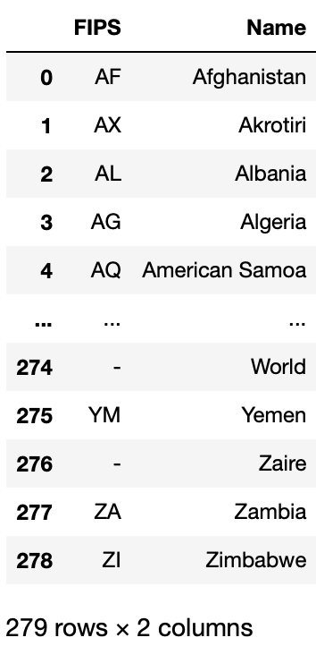
It looks good to us, thus we can create the table now.
# create table
countries.to_sql("countries", conn, if_exists = "replace", index = False)
After Creating Tables
It is important to close the connection to the database once we’re done.
# close the database connection
conn.close()
3. Before We Plot
We will be doing some data cleaning and analysis to the data we’re going to query. Thus, we first define some helper functions here for the steps that we’ll be doing multiple times. What each function does is explained in the documentation inside the functions.
A new function we used here is transform: this function works similar to apply, but instead of calculating one value for the datagroup, it generates the same value for each original row of the datagroup.
This helper function filters rows based on the number of observations.
def filtering(df, min_obs):
"""
This function takes in a piece of dataframe,
and returns a filtered version of the dataframe.
"""
# create a count column based on the number of observations for a specific station at a specific month
df["counts"] = df.groupby(["NAME", "Month"])["Year"].transform('count')
# filters each row based on the count column
df_filtered = df[df['counts'] >= min_obs]
return df_filtered
This function calculates the coefficient from the regression of x and y in the datagroup.
def coef(data_group):
"""
This function takes in a data group,
and returns the coefficient from the regression of x and y.
"""
x = data_group[["Year"]] # 2 brackets because X should be a df
y = data_group["Temp"] # 1 bracket because y should be a series
LR = LinearRegression()
LR.fit(x, y) # fit the regression
return LR.coef_[0] # returns the first coefficient from the regression
This function uses the coef function above, to calculate coefficient for each datagroup inside a dataframe, then create a new dataframe of coefficients.
def coef_col(df):
"""
This function takes in a piece of dataframe,
calculates coeffients for each datagroup,
then returns a dataframe of the coefficients.
"""
# calculating coefficient from linear regression
coefs = df.groupby(["NAME", "Month"]).apply(coef)
# rearrange the index
coefs = coefs.reset_index()
# round each coefficient to 4 decimal
coefs[0] = coefs[0].round(4)
# rename the coefficient column
coefs = coefs.rename(columns={0: "Estimated Yearly Increase (C°)"})
return coefs
Now we can finally start plotting!
For each plot, we will be doing 2 steps:
- write a query function to query the information we need
- write a plotting function so that it’s easier for user to change parameters
4. First Plot
a. query function
We will be using pd.read_sql_query(). This function allows us to query using SQL command from a local database. It works like below:
# cmd: a string, consisting of SQL command
# conn: connection to database
df = pd.read_sql_query(cmd, conn)
Let’s also learn some SQL query basics:
SELECT: the colomns of a table you wish to select
FROM: the table you wish to get data from
LEFT JOIN and ON: joins two or more tables together, and on decides which column the two tables should agree on
WHERE: add conditions to the query
AS: gives your column/table a nickname.
Finally, the command should end with a semicolon.
Now we can write our query function! We wish to write a function that gives us
- The station name.
- The latitude of the station.
- The longitude of the station.
- The name of the country in which the station is located.
- The year in which the reading was taken.
- The month in which the reading was taken.
- The average temperature at the specified station during the specified year and month.
The function looks like the following:def query_climate_database(country, year_begin, year_end, month): """ This function takes 4 arguments: country: a string giving the name of a country for which data should be returned. year_begin and year_end: two integers giving the earliest and latest years for which should be returned. month: an integer giving the month of the year for which should be returned. It returns a Pandas dataframe of temperature readings for the specified country, in the specified date range, in the specified month of the year. """ # sql command for the query cmd = \ f" SELECT S.NAME, S.LATITUDE, S.LONGITUDE, C.Name AS Country, T.Year, T.Month, T.Temperature AS Temp\ FROM temperatures T \ LEFT JOIN stations S \ ON T.ID=S.ID \ LEFT JOIN countries C \ ON C.FIPS=SUBSTRING(T.ID, 1, 2)\ WHERE Country='{country}' AND T.Year>={year_begin} AND T.Year<={year_end} AND T.Month={month};" # connect to the database created conn = sqlite3.connect("temp.db") # create a dataframe based on the information queried df = pd.read_sql_query(cmd, conn) # close the database connection conn.close() return df
Let’s look at whether this function works:
df1 = query_climate_database(country = "India",
year_begin = 1980,
year_end = 2020,
month = 1)
df1
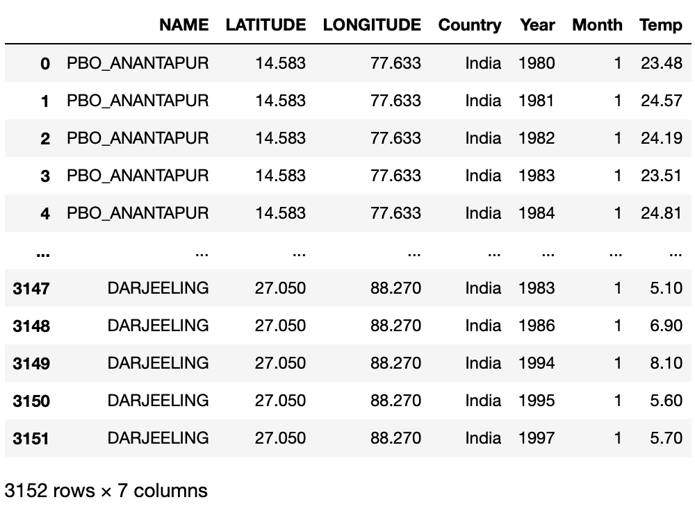
It works as we desired! Now we can use this function to create our plotting function.
b. plotting function
We’ll be using plotly.express to make our interactive visualization. It looks similar to the matplotlib we’ve been using, but it starts by specifying a dataframe. Then, x, y, and several other arguments are interpreted as columns of the supplied dataframe.
To make a scatter plot on a map, we choose to use the scatter_mapbox function. As we will see below, we use it like this:
px.scatter_mapbox(final_pd,
lat = "LATITUDE",
lon = "LONGITUDE",
hover_name = "NAME",
color = "Estimated Yearly Increase (C°)",
title=f"Estimates of Yearly Increase in Temperature <br> \
in month {month}, stations in {country}, \
year {year_begin}-{year_end}",
**kwargs)
lat: the column in the dataframe that represents latitude
lon: the column in the dataframe that represents longitude
hover_name: the message that shows up when we hover over a dot
color: the color of each dot depends on this column’s value
title: plot title
As we have created the query function, the filtering function, and function to calculate coefficient, we can write a clean plotting function using these helper functions. \
Steps we will take:
- use the query_climate_database function to get the dataframe we want, with the arguments passed in from the plotting function
- use the filtering function to select data only for stations with at least min_obs years worth of data
- use the coef_col function to calculate coefficient from linear regression
- use merge to add the longitude and latitude information to the coefs dataframe
- use plotly.express.scatter_mapbox to plot!
def temperature_coefficient_plot(country, year_begin, year_end, month, min_obs, **kwargs):
"""
This function takes 5 arguments and an undetermined number of keyword arguments.
country: a string giving the name of a country for which data should be returned.
year_begin and year_end: two integers giving the earliest and latest years for which should be returned.
month: an integer giving the month of the year for which should be returned.
min_obs: the minimum required number of years of data for any given station.
**kwargs, additional keyword arguments passed to px.scatter_mapbox().
This function plots an interactive geographic scatterplot,
constructed using Plotly Express, with a point for each station,
such that the color of the point reflects an estimate of the yearly
change in temperature during the specified month and time period at that station.
"""
# creating dataframe with the arguments passed in
df = query_climate_database(country, year_begin, year_end, month)
# select data only for stations with at least min_obs years worth of data
df_filtered = filtering(df, min_obs)
# calculating coefficient from linear regression
coefs = coef_col(df_filtered)
# add latitude and longitude to the coefficient dataframe
final_pd = pd.merge(coefs,
df_filtered[["NAME", "LATITUDE", "LONGITUDE"]].drop_duplicates(),
on=["NAME"])
# plot with plotly
fig = px.scatter_mapbox(final_pd,
lat = "LATITUDE",
lon = "LONGITUDE",
hover_name = "NAME",
color = "Estimated Yearly Increase (C°)",
title=f"Estimates of Yearly Increase in Temperature <br>in month {month}, stations in {country}, year {year_begin}-{year_end}",
**kwargs)
return (fig)
Let’s look at the output:
color_map = px.colors.diverging.RdGy_r
fig = temperature_coefficient_plot("India", 1980, 2020, 1,
min_obs = 10,
zoom = 2,
mapbox_style="carto-positron",
color_continuous_scale=color_map,
width=800)
fig.show()
It looks fantastic!
This step is optional. We do this in order to put the plot in our blog.
write_html(fig, "blog1-plot1.html")
5. Second Plot
a. query function
Similarly, we will be using pd.read_sql_query. We want to make a choropleth this time, thus we need every country’s data. And since we’ll have the geojson data, we don’t need the latitude and longitude data anymore. And we will average the temperatures of all stations in that country. We wish to write a function that gives us
- The name of the country in which the station is located.
- The year in which the reading was taken.
- The month in which the reading was taken.
- The average temperature among the stations in a specific country during the specified year and month.
The function looks like the following:
def query_climate_database2(year_begin, year_end, month):
"""
This function takes 3 arguments:
year_begin and year_end: two integers giving the earliest and latest years for which should be returned.
month: an integer giving the month of the year for which should be returned.
It returns a Pandas dataframe of temperature readings for the specified country, in the specified date range, in the specified month of the year.
"""
# sql command for the query
cmd = \
f" SELECT C.Name AS NAME, T.Year, T.Month, AVG(T.Temperature) AS Temp\
FROM temperatures T \
LEFT JOIN countries C \
ON C.FIPS=SUBSTRING(T.ID, 1, 2)\
WHERE NAME IS NOT NULL AND T.Year>={year_begin} AND T.Year<={year_end} AND T.Month={month} \
GROUP BY NAME, T.Year, T.Month;"
# connect to the database created
conn = sqlite3.connect("temp.db")
# create a dataframe based on the information queried
df = pd.read_sql_query(cmd, conn)
# close the database connection
conn.close()
return df
Let’s look at whether this function works:
df2 = query_climate_database2(year_begin = 1980, year_end = 2020, month = 1)
df2
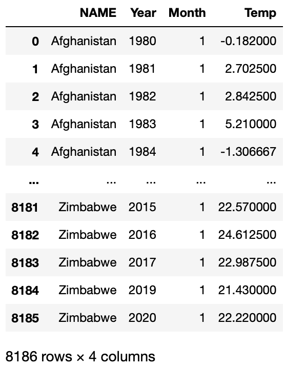
It works as we desired! Now we can use this function to create our plotting function.
b. plotting function
First, we need to import the geojson data.
from urllib.request import urlopen
import json
countries_gj_url = "https://raw.githubusercontent.com/PhilChodrow/PIC16B/master/datasets/countries.geojson"
with urlopen(countries_gj_url) as response:
countries_gj = json.load(response)
Now we have the geojson data for each country in variable countries_gj.
To make a choropleth on a map, we choose to use the choropleth function. As we will see below, we use it like this:
px.choropleth(coefs,
geojson=countries_gj,
locations = "NAME",
locationmode = "country names",
color = "Estimated Yearly Increase (C°)",
title=f"Estimates of Yearly Increase in Temperature <br> \
for all countires in month {month}, \
year {year_begin}-{year_end}",
**kwargs)
geojson: the geographic data for each country
locations: the column in the dataframe that represents country name
locationmode: how the geographic data would match up with the dataframe
color: the color of each dot depends on this column’s value
title: plot title
Steps we will take are similar to the first plot, except that we won’t be merging for the longitude and latitude data (since we don’t need them).
def temperature_coefficient_plot2(year_begin, year_end, month, min_obs, **kwargs):
"""
This function takes 4 arguments and an undetermined number of keyword arguments.
year_begin and year_end: two integers giving the earliest and latest years for which should be returned.
month: an integer giving the month of the year for which should be returned.
min_obs: the minimum required number of years of data for any given station.
**kwargs, additional keyword arguments passed to px.scatter_mapbox().
This function plots an interactive geographic scatterplot, constructed using Plotly Express, with a point for each station, such that the color of the point reflects an estimate of the yearly change in temperature during the specified month and time period at that station.
"""
# creating dataframe with the arguments passed in
df = query_climate_database2(year_begin, year_end, month)
# select data only for stations with at least min_obs years worth of data
df_filtered = filtering(df, min_obs)
# calculating coefficient from linear regression
coefs = coef_col(df_filtered)
fig = px.choropleth(coefs,
geojson=countries_gj,
locations = "NAME",
locationmode = "country names",
color = "Estimated Yearly Increase (C°)",
title=f"Estimates of Yearly Increase in Temperature <br> \
for all countires in month {month}, \
year {year_begin}-{year_end}",
**kwargs)
return (fig)
Let’s look at the output:
fig = temperature_coefficient_plot2(1980, 2020, 1, min_obs = 10,
color_continuous_scale=color_map,
width=800)
fig.show()
Now we can easily tell each country/region’s average temperature increase in a specific month!
6. Third Plot
a. query function
Finally, let’s make the third plot.
We want to make a histogram of each station’s average temperature increase in a specific month, and use facet to compare different months, thus we need every month’s data. And since we won’t be plotting on a map, we don’t need the latitude and longitude data.
Thus, we wish to write a function that gives us
- The station’s name
- The name of the country in which the station is located.
- The year in which the reading was taken.
- The month in which the reading was taken.
- The average temperature in a specific station during the specified year and month.
The function looks like the following:
def query_climate_database3(country, year_begin, year_end, month_begin, month_end):
"""
This function takes 5 arguments:
country: a string giving the name of a country for which data should be returned.
year_begin and year_end: two integers giving the earliest and latest years for which should be returned.
It returns a Pandas dataframe of temperature readings for the specified country, in the specified date range.
"""
# sql command for the query
cmd = \
f" SELECT S.NAME, C.Name AS Country, T.Year, T.Month, T.Temperature AS Temp\
FROM temperatures T \
LEFT JOIN stations S \
ON T.ID=S.ID \
LEFT JOIN countries C \
ON C.FIPS=SUBSTRING(T.ID, 1, 2)\
WHERE Country='{country}' AND T.Year>={year_begin} AND T.Year<={year_end} AND T.Month>={month_begin} AND T.Month<={month_end};"
# connect to the database created
conn = sqlite3.connect("temp.db")
# create a dataframe based on the information queried
df = pd.read_sql_query(cmd, conn)
# close the database connection
conn.close()
return df
Let’s look at whether this function works:
df3 = query_climate_database3(country="India", year_begin = 1980, year_end = 2020,
month_begin = 1, month_end = 3)
df3
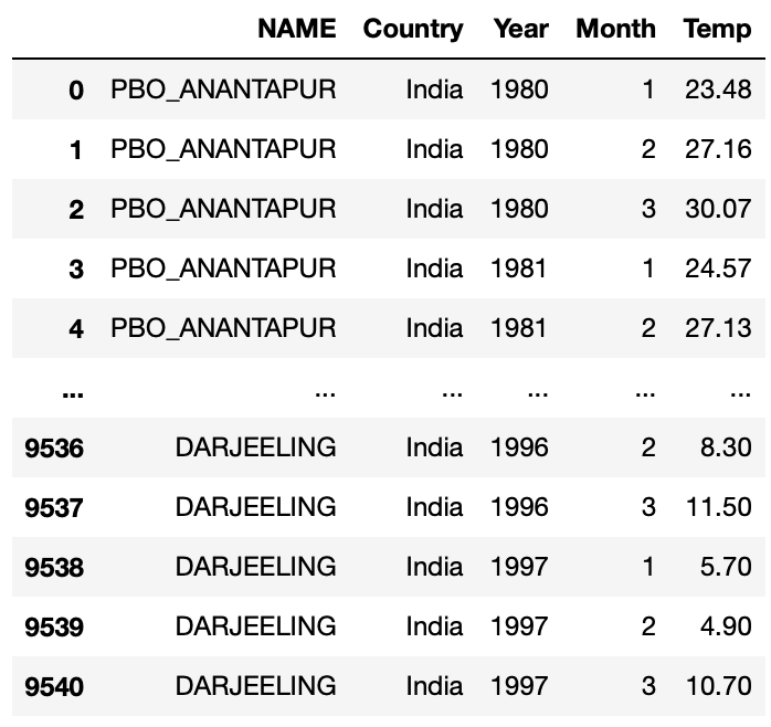
It works as we desired! Now we can use this function to create our plotting function.
b. plotting function
Here we choose to use the histogram function. As we will see below, we use it like this:
px.histogram(coefs,
x = "Estimated Yearly Increase (C°)",
hover_name = "NAME",
facet_row = "Month",
barmode='stack',
title=f"Counts of Stations for Average Temperature Increase <br> \
month {month_begin}-{month_end}, stations in {country}, \
year {year_begin}-{year_end}",
**kwargs)
facet_row: what to separate each subplot by
barmode: how each bar of counts is generated
Steps we will take are similar to the second plot.
def temperature_coefficient_plot3(country, year_begin, year_end,
month_begin, month_end, min_obs, **kwargs):
"""
This function takes 6 arguments and an undetermined number of keyword arguments.
country: a string giving the name of a country for which data should be returned.
year_begin and year_end: two integers giving the earliest and latest years for which should be returned.
month_begin and month_end: two integers giving the earliest and latest month of the year for which should be returned.
min_obs: the minimum required number of years of data for any given station.
**kwargs, additional keyword arguments passed to px.scatter_mapbox().
This function plots an interactive geographic scatterplot, constructed using Plotly Express, with a point for each station, such that the color of the point reflects an estimate of the yearly change in temperature during the specified month and time period at that station.
"""
df = query_climate_database3(country, year_begin, year_end, month_begin, month_end)
# select data only for stations with at least min_obs years worth of data
df_filtered = filtering(df, min_obs)
# calculating coefficient from linear regression
coefs = coef_col(df_filtered)
fig = px.histogram(coefs,
x = "Estimated Yearly Increase (C°)",
hover_name = "NAME",
facet_row = "Month",
barmode='stack',
title=f"Distribution of Stations for Average Temperature Increase <br>month {month_begin}-{month_end}, stations in {country}, year {year_begin}-{year_end}",
**kwargs)
return (fig)
Let’s look at the output:
fig = temperature_coefficient_plot3("India", 1980, 2020, 1, 3,
min_obs = 10,
opacity = 0.5,
nbins = 30,
width=500)
fig.show()
Now we can easily tell the distrubution of the average temperature increase in a specific country and in a specific month!
We’re done with the interactive visualization! Feel free to leave a comment below if you have any question/sugeestions.