
Post 0 (Visualization 1)
Let’s make a visualization for the Palmer Penguin dataset!
Preparation
Inspect Raw Data
Let’s read the raw data first:
import pandas as pd
url = "https://raw.githubusercontent.com/PhilChodrow/PIC16B/master/datasets/palmer_penguins.csv"
penguins = pd.read_csv(url)
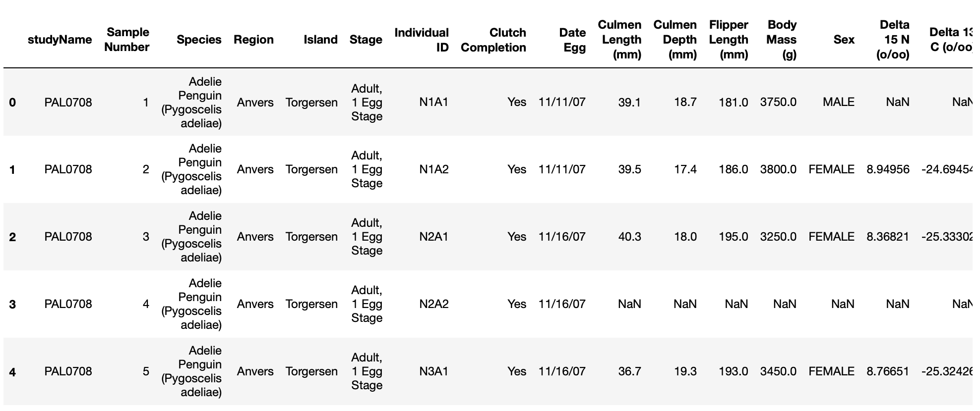
Now we have a pandas dataframe of the penguins data. Let’s take a look at this dataframe:
penguins
Before We Start
First, let’s choose the features that we want to plot.
I decided to plot Culmen Length and Flipper Length.
Second, let’s think about how we want this visualization to look like.
I want to do a scatter plot for each row (representing each penguin in the sample), and use different colors and shapes to distinguish different penguins. And I want to use Culmen Length as the x-axis, Flipper Length as the y-axis.
Third, let’s choose what package to use for the plotting.
Since I want to plot 2 columns at a time, and seperate the data based on penguin species, I decided to use the package seaborn for visualization.
Data Cleaning
Let’s clean the data first according to our plan.
Choose Columns
We write a list of the columns we need, and create a new dataframe with only these columns.
cols = ["Species", "Culmen Length (mm)", "Flipper Length (mm)"]
df = penguins[cols]
Edit Columns
The texts in the Species column seems too long for us to read. We only need the first word for each entry, and we can use the .str keyword to achieve that:
df["Species"] = df["Species"].str.split().str.get(0)
Drop Empty Rows
Let’s drop the rows with “Nan” values:
df = df.dropna()
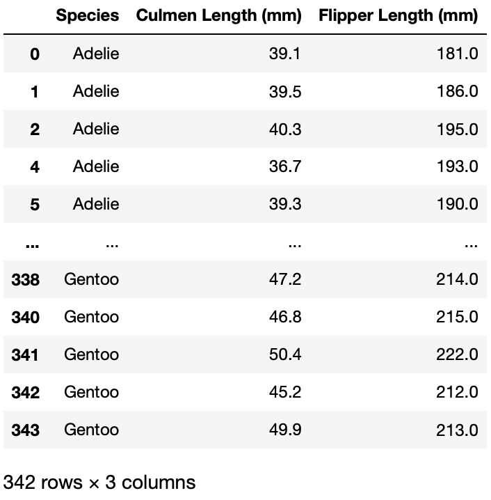
Inspect Cleaned Data
Now let’s take a look at the cleaned dataframe:
df
Plot
First import seaborn and set theme.
import seaborn as sn
sn.set_theme()
Now we can plot with seaborn!
g = sn.lmplot(
    data=df,			# the data to plot
    x="Culmen Length (mm)", 	# choose x-axis
    y="Flipper Length (mm)", 	# choose y-axis
    hue="Species",		# choose how to separate the dots
    height=5			# choose plot height
)

# Set title and axis labels
g.set(title="Palmer Penguins", xlabel="Culmen Length (mm)", ylabel="Flipper Length (mm)")
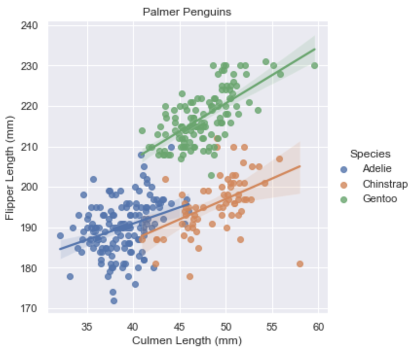
Now we’re done with the visualization! Feel free to leave a comment below if you have any question/sugeestions.